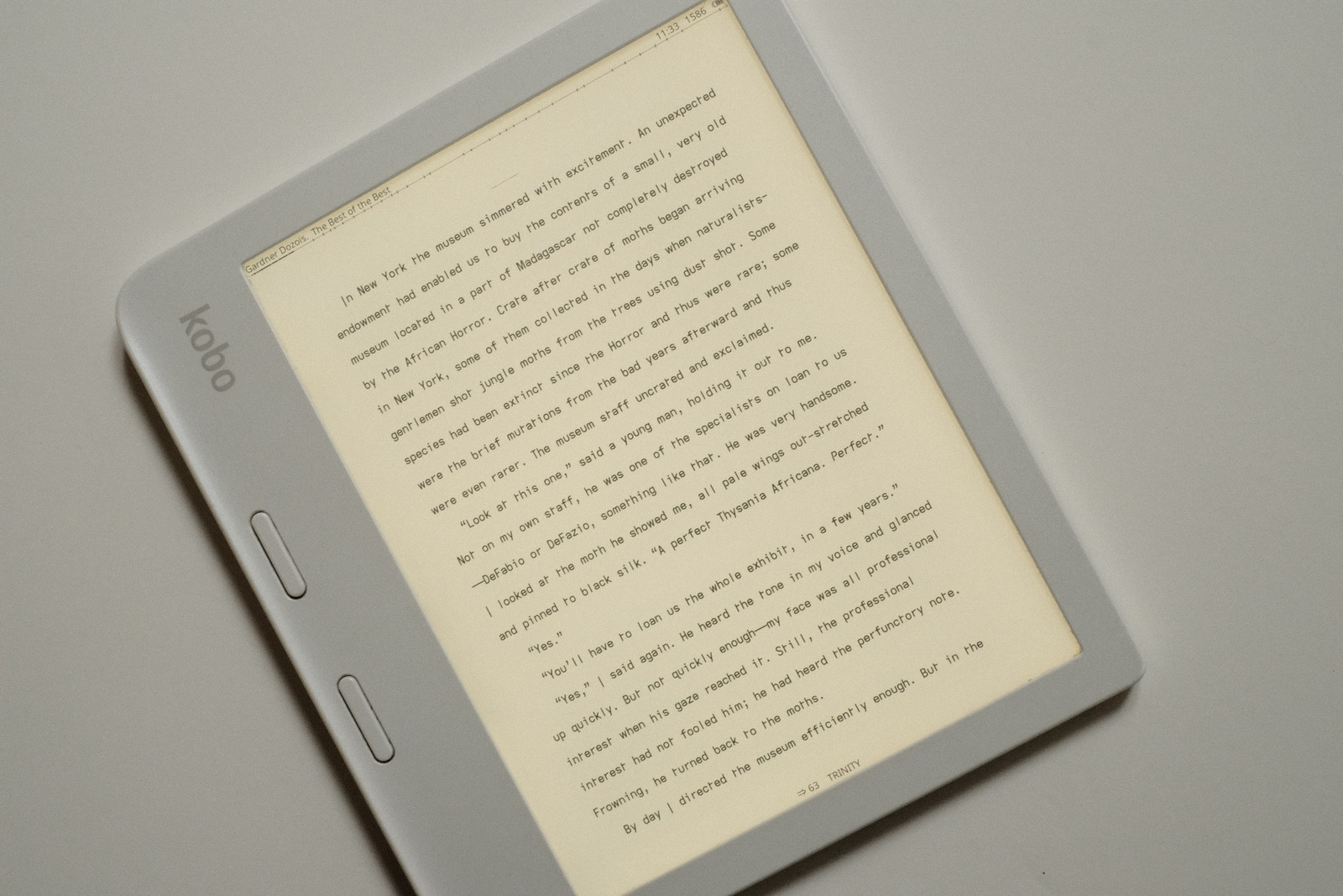
asymmetric font trio
“flat” fonts and the asymmetric lower case t have become my main focus of late—the increased air between lines taking precedence over earlier typefaces using extended/descending glyphs. A different feel that i have settled on for small font sizes on ereaders.
tl;dr Typeface differences..
| letter | grote | stria | patio |
|---|---|---|---|
| (eye) I | descending-serifless | serifless | serifed |
| a | toothless-double-storey | toothless-double-storey | single-storey |
| (el) l | serifless | flat-tailed | serifless |
| (tee) t | hookless-asymmetric | hooked-asymmetric | hookless-cross |
| y | straight | straight-turn | straight |

asymmetry
The typefaces created on this site applied increasingly, dyslexic glyph choices to eliminate mirrored glyph shapes to enhance readability, culminating in..
For the lower case b d p q..
| glyph | shape |
|---|---|
| b | toothless-rounded |
| d | toothed |
| p | earless-corner |
| q | hook-tailed |
For the lower case m n u..
| glyph | shape |
|---|---|
| m | earless-rounded |
| n | straight |
| u | toothless-rounded |
For the lower case f t..
| glyph | shape |
|---|---|
| f | serifless |
| t | hookless-asymmetric |
The asymmetric lower case t is a glyph choice i would not have made a year ago—it being a radical departure from the ubiquitous cross, so much so, the flat-tailed shape evaded comparison to the lower case f (and probably why, for a time, several font variations favoured the extended f). Its minimalist geometry and air appear to be even easier—to my eyes, at least—to identify. Word recognition feels faster and more effortless. It has a sense of “velocity” versus the more anchored static look of the cross—a preference which is highly personal.
The benefit of non-mirrored glyph shapes not only for dyslexia but for visual processing in general, is most apparent in words containing combinations of what would otherwise be mirrored glyphs shapes. Non-mirrored glyphs do not tax our visual cortex which our mind constantly seeks to find patterns with—fewer neural cycles are consumed to separate their shapes and meaning, subtly relaxing the visual effort and quickening word recognition.
air
For visual air to adjacent letters..
| glyph | shape |
|---|---|
| a | double-storey-toothless-corner |
The toothless lower case a was a late discovery—the toothed glyph shape being universally imprinted. The touch of added air to the base of the letter is noticeable when preceding the left vertical stroke of the lower case letters h k m n p r t—especially at small font sizes—lessening the visual density to the eye. (From a dyslexic perspective, the loss of the tooth as an anchor point may be a negative for some—for which case, the earlier typefaces may be preferable).
All told, these dyslexic glyph choices comprise roughly 40% of both the English alphabet and usage by words and letters for a substantial impact to the reading effort and legibility.
Monospaced cell width promotes an even visual cadence for the eyes—the M W glyphs being an exception with their 1.25x cell width to render more appealing proportions (versus their commonly “squished” representations with strict monospaced coding fonts).
Increasing word separation also enhances readability. Starting at double (cell width) Space, the word spacing of subsequent font variations has slowly tightened to 1.15x cell width—the reduction more a matter of aesthetic page density whilst maintaining adequate word separation.
Adequate line height—a minimum of 1.5x line height—is also recommended for maximum readability.
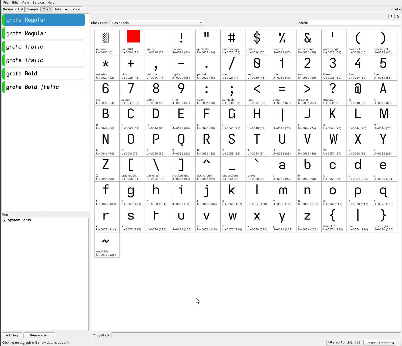
grote font
the grote font with its toothed-hookless capital G, open capitals B P R and 4, and distinctive descending serifless capital I is a nod to sans serif geometric typefaces..

The descender adds presence to the singular glyph stroke of the capital I to easily distinguish it from the serifless lower case l (for these eyes). The downside being the descender in all caps titles, phrases and Roman Numerals—some may find it difficult to get used to (whereas, i find it a unique flair. YMMV).
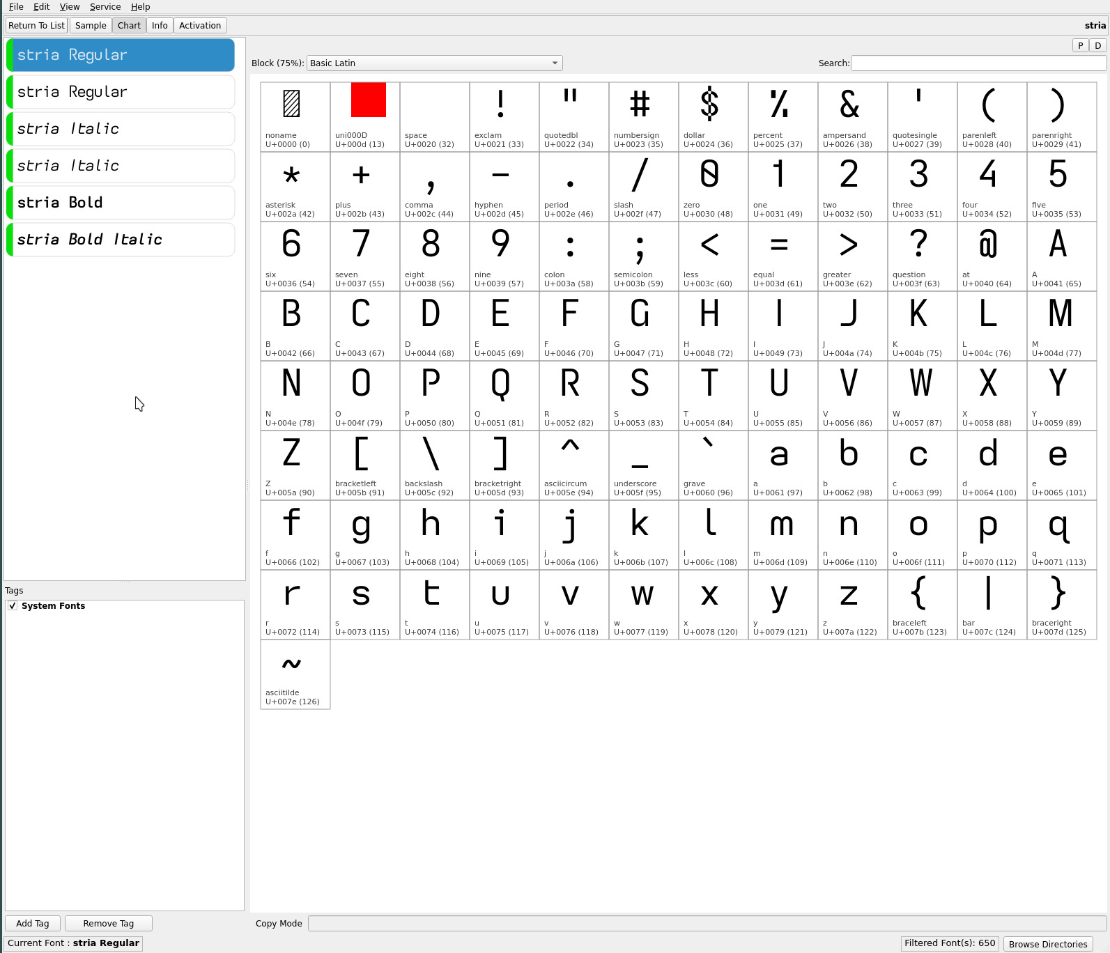
stria font
stria returns with its flat-tailed lower case l, flat-hook-asymmetric lower case t and straight-turn lower case y and its heritage from earlier fonts, influenced by the embellishments of the Atkinson Hyperlegible Font. The former serifed capital I (which was “unnecessarily distinct” with this glyph set—not a bad thing when it comes to dyslexia) is replaced with the serifless capital as the complement to the flat-tailed lower case l..

This font is easy on the eyes with its graceful hooks and tails—and, i suspect, the most accessible of the font trio (even with its asymmetric t).
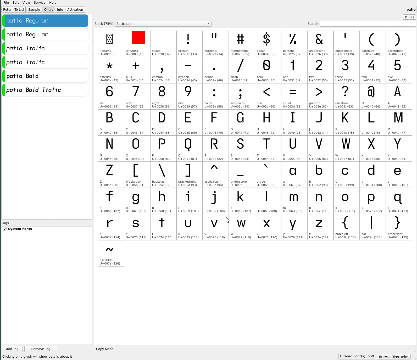
patio font
a complement to the asymmetric duet is the patio font with its single-storey lower case a. With three simple glyph changes (from grote), this typeface has a very classic feel with its serifed capital I and familiar hookless-cross lower case t and scholastic single-storey a..

The elementary font with its single-storey a was, during its time, one of my favourite fonts for reading. Against the earlier typefaces, it stood out for its airier lines of text, the lower case a letter combinations benefitting from the glyph’s open shape.
While a fan of the asymmetric lower case t, the hookless-cross and serifed capital I with their more anchored presence better balance the static shape of the single-storey a—at least, to these eyes.
All told, the high legibility of this font trio provides a broad typeface style range to choose from. Previous font sets (for me) tended to have a visually dominant font—this trio feels more even, with each font expressing a unique character. YMMV.
‧ ‧ • ‧ ‧
The capital I glyph shape has always been the difficult design choice—the serifless glyph with its clean geometry, always challenged by the lower case l (and 1) for legibility. Finally, i think! i may have found glyph sets that mate best visually and aesthetically (pour moi, at least) each of the descending-serifless, serifless and serifed expressions of this letter.
Add to that, after exclusive use of the Atkinson Hyperlegible font’s flat-hooked lower case t over many generations of fonts, this font trio further separates itself with the glyph in cross, hooked- and hookless-asymmetric shapes—making these fonts feel very different from their early predecessors.
i’ve stated far too many times that i have reached the end of this dyslexic font exploration. Barring a complete glyph set direction, however, i may “finally finally!” have found a font trio that will remain untouched on my ereaders for the months to come (though, my kids always roll their eyes when i ship my latest font releases to them for their ereaders :).
As always, YMMV.
repos
These asymmetric font variants may be found on OneDrive.